Our Logo
Our logo is composed of three elements: a green background fill, our symbol and our company name Envac in white. The aim is to clearly emphasise that all products bearing this stamp have an obvious raison d’être in a sustainable future. The symbol represents the pipe with which Envac change and protect the planet for future generations. The elements must always be used together and can only be used separately in very specific cases. Our logo must be used in all points of contact. It helps people easily identify and recognise Envac’s products, websites, advertisements and so on. The inlet doors in our installations must always come with the logo laser engraved, machine milled or visible in digital display
(see Product Design). The logo should always be used with care and respect, and always following these guidelines.
Visually optimized
At a first glance, the green background fill appears to be square, but it is actually not. It is 10% wider than it is high, for maximum optical effect.
If it had been completely square, the green surface would take precedence and the text and symbol would be smaller, making it weaker.
Envac’s logo is optimised for attention and readability.
Logo on drawings
Use this logotype in the title block on our drawings. Please do not use elsewhere.
The name and icon are black, and you can choose with black outline or without, depending on the design of the title block.
Logo in operator panels
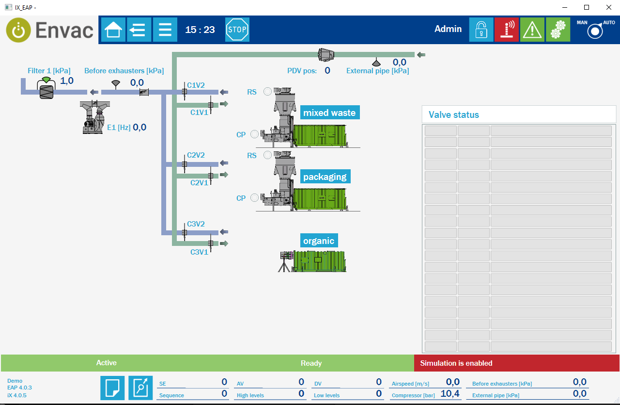
This special branding is for use in our operator panels, and only because our logotype does not fit properly in the panel header. Do not use elsewhere.
It consists of two elements, our special round logo + Envac in text (Roboto).
Note carefully that the round version of the logo is created for use in social channels like Instagram, where the original logo cannot be used.
The image background is transparent. Place over light grey background in the panel for the best result.

The different file formats of the logo
An AI file is saved in vector format and can be enlarged indefinitely without losing its quality. Optimal for print and creating large expo productions.
CMYK stands for the four inks Cyan, Magenta, Yellow and Key-color (black). It is used for printed matters and is also called four-color printing.
PMS is an abbreviation for Pantone Matching System. It is a ready-mixed of so-called decorative colours. It is used for single colour printing.
PNG is a file format for images and is mainly used on websites and in digital productions.


Logo colours
Our logo consists of a green background fill with a white icon and text on it.
If you need a black and white version or have other questions regarding colour use, contact the Global Brand Manager.
- Envac Green
- Envac White
> See Colour Palette

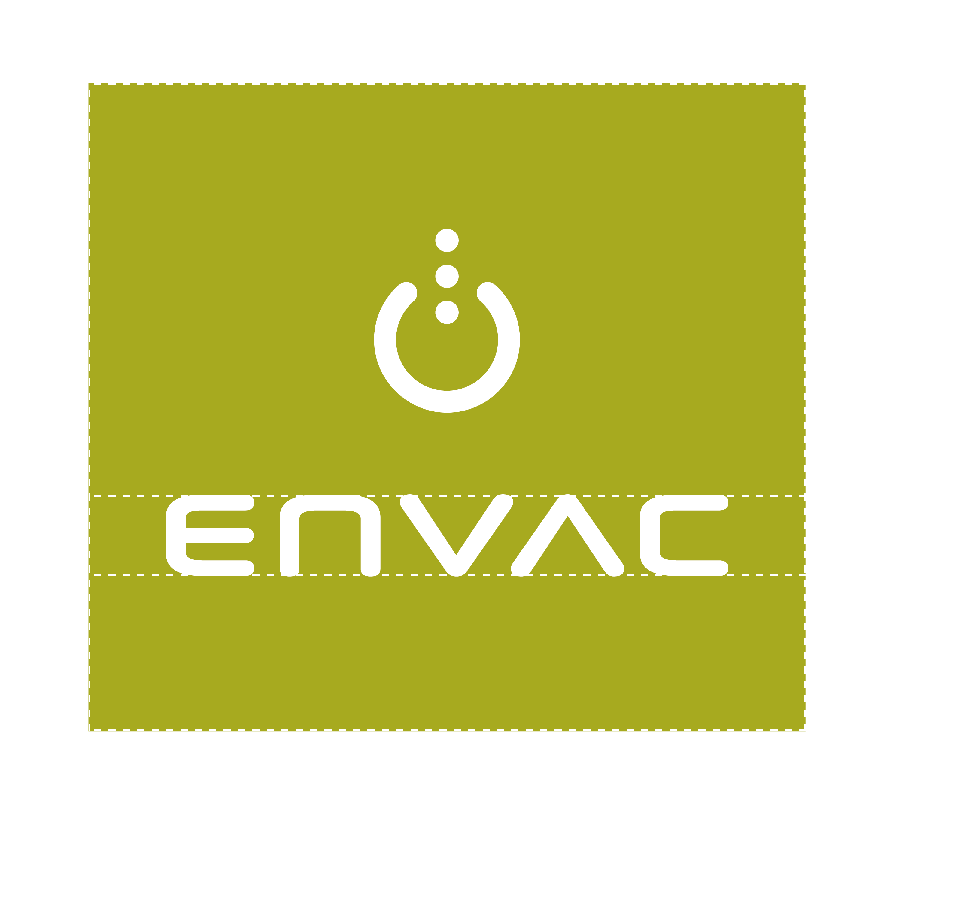
Logo clear space
Our logo is important, it should be given space. Use the following guide to ensure that other objects (texts, images etc.) never encroach upon the logo or the clear space.
Logo minimum size
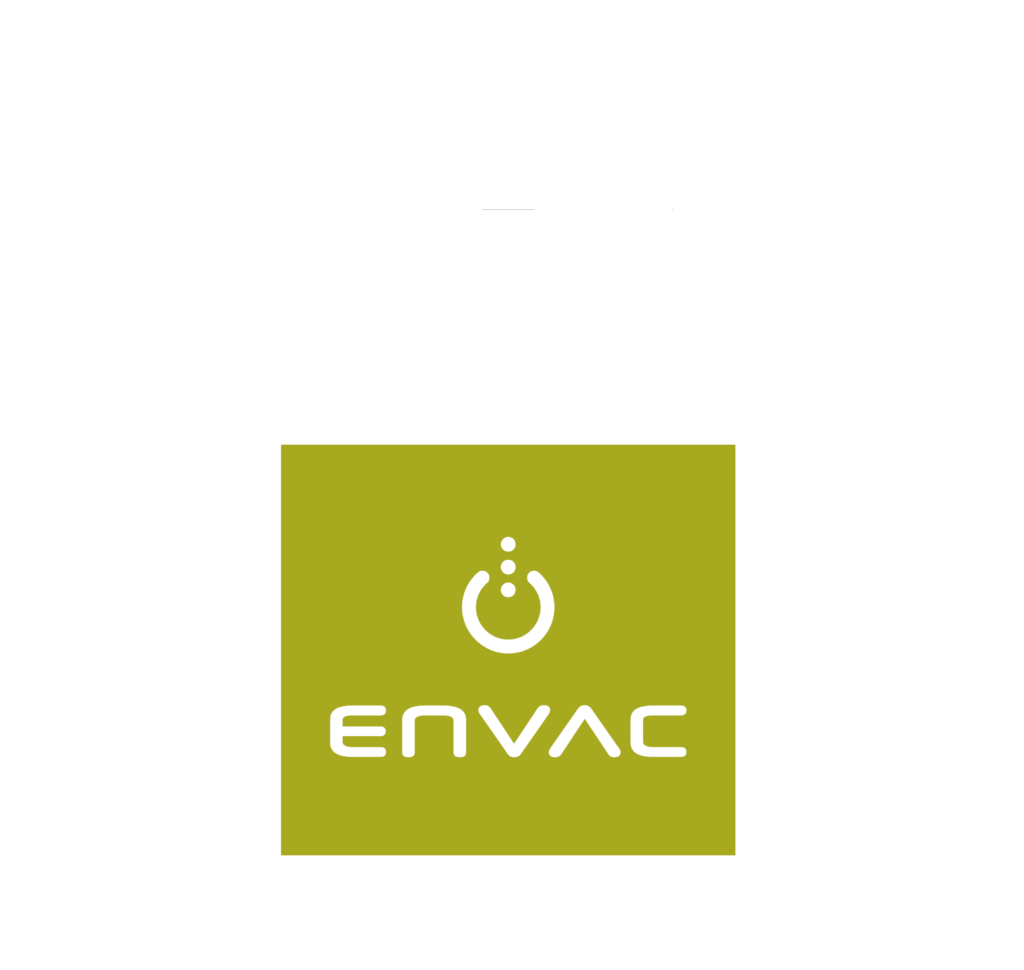
Our logo is bold and resilient, and there is a limit to how small it should be reproduced.
Logo rules
The simple rule is: if you don’t alter or add anything, you are using the logo correctly.
However, there are situations when you are asked to adapt the logo, usually related to a customer request. In these situations, you must present a draft to Global Brand Manager for advice and approval. Make sure you this at an early phase– before it is too late to make changes.
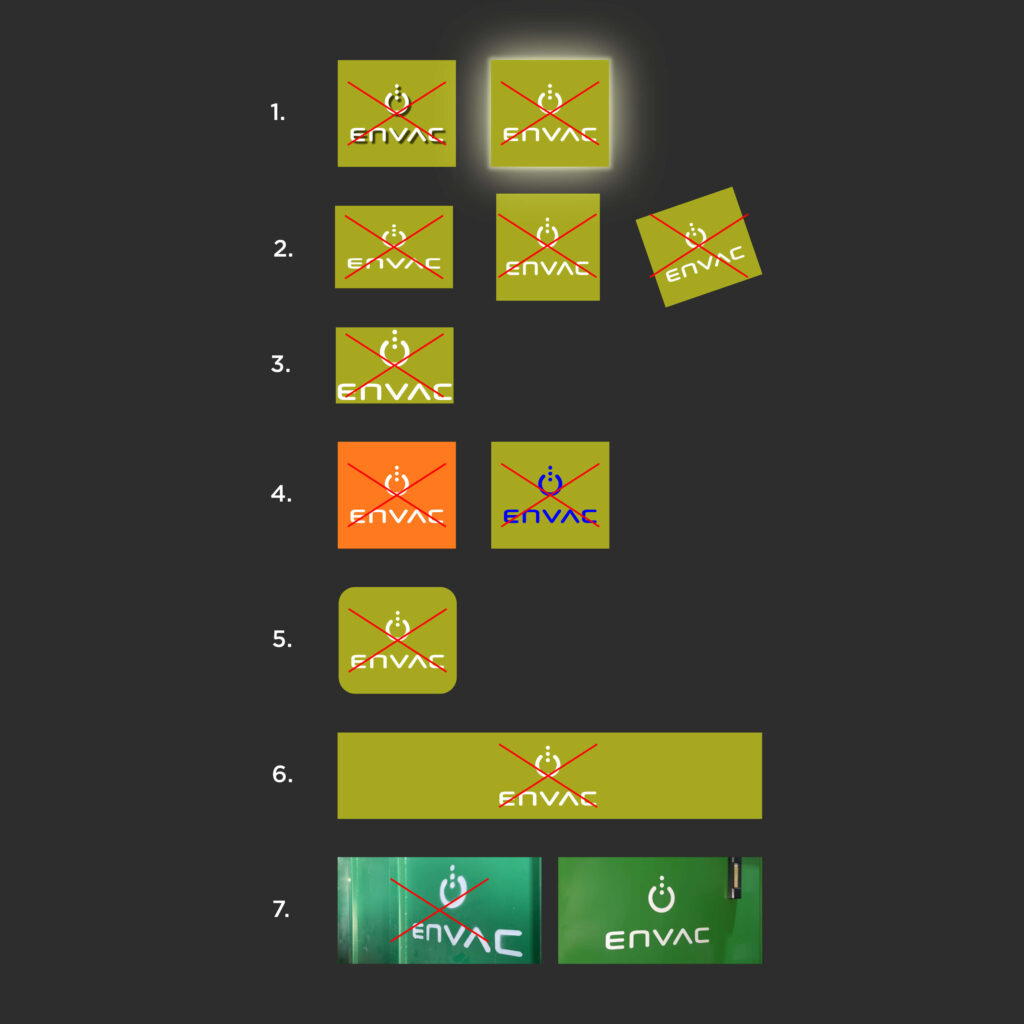
Here are few examples of things to avoid when using our logotype.
Do not
- add shadows, dimensions, gradients or illuminate the logo.
- distort by stretching, compressing or rotating single elements or the complete logotype
- alter the size of the background fill, it will destroy the visual optimisation
- change the colour of the background fill or the icon/text
- change corners to round
- use the icon/text without background fill anywhere except on our products. This example is quite common, also seen on event backdrops. It is not approved.
- paint the logo if you can avoid – use a peel-off sticker (see section Colour palette)
Logo placement
When using the logo on images, videos and presentation slides – leave space to the right of the logo and place it in the lower right corner increasing visibility.
Adjust the logo size to the size of the image and the channel.
Separate logo placement rules applies for web sites (section Marketing- Communications), social media (section Social Media) and events (section Contextual Design).
Logo embossed
The embossed silver logo may only be used on our products and only with special permission from the Global Brand Manager. Please respect this rule.
Co-branding
By using two brands together we symbolise partnership. Each brand always constitutes a set of promises that people associate with the company.
Care must be taken to ensure that we are not misrepresenting the product or service of either brand, confusing the market or the end user.
To make sure that we benefit from our partnerships with other brands, it is of utmost importance that we clearly and appropriately communicate our association in a correct manner.
Co-branding on waste inlets
On our waste inlets the logotype of our partner’s/client’s logo should be placed higher than ours (See Product Design)
Our logo is bold and resilient, but there is a limit to how small it should be reproduced.
