Section
Contextual Design
Events
At events, we intend to be as digital as we possibly can.
We always prefer digital screens over backdrops and roll-ups.
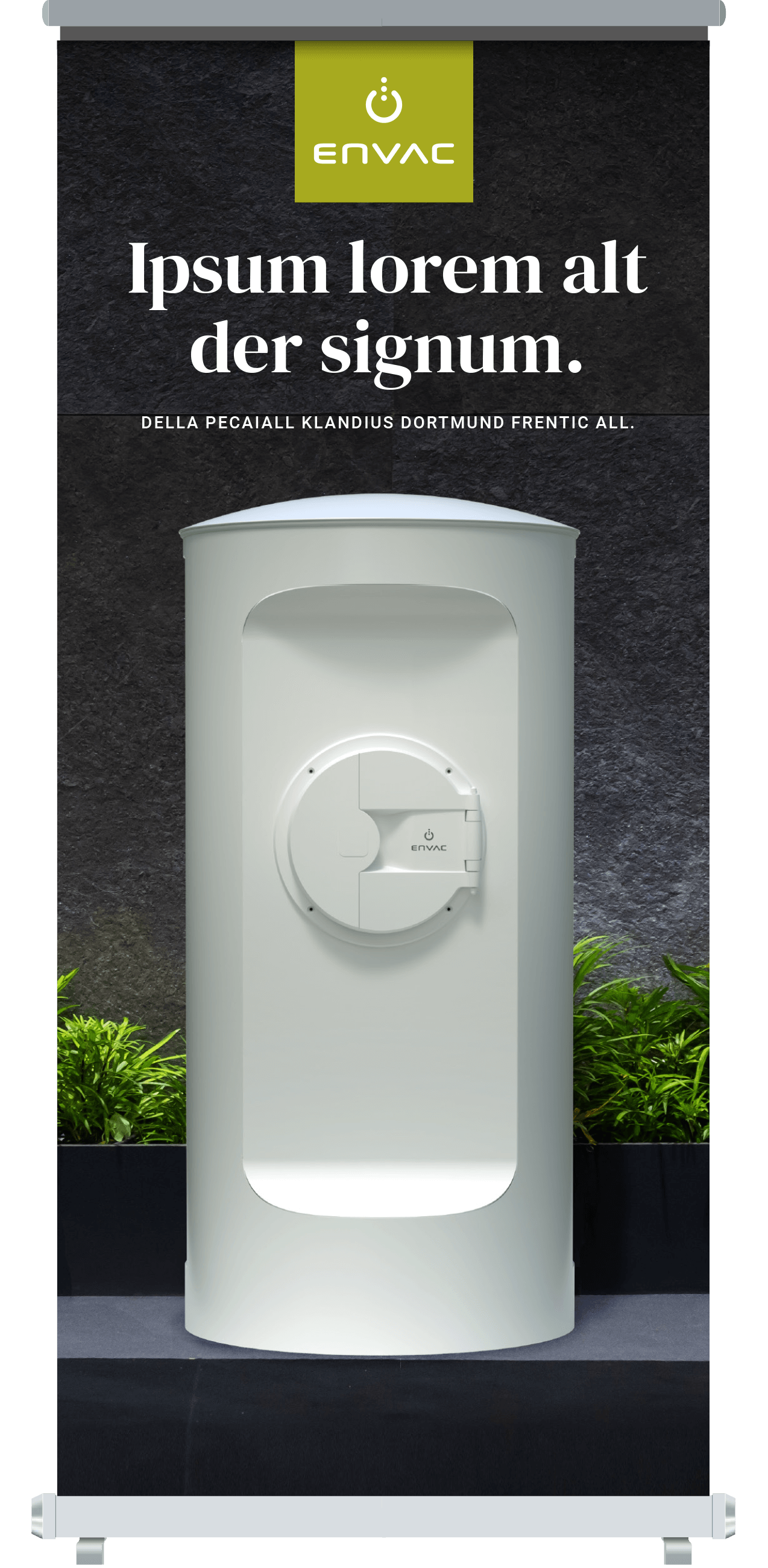
If you do use roll-ups, this is an example of our new design. The logo has been moved from bottom right to the top for visibility and all content is centered.
You can access Envac’s guide to creating successful exhibitions and events, with clear steps for before, during and after, in our DAM solution. Please note that external access requires prior approval.
Signs and display
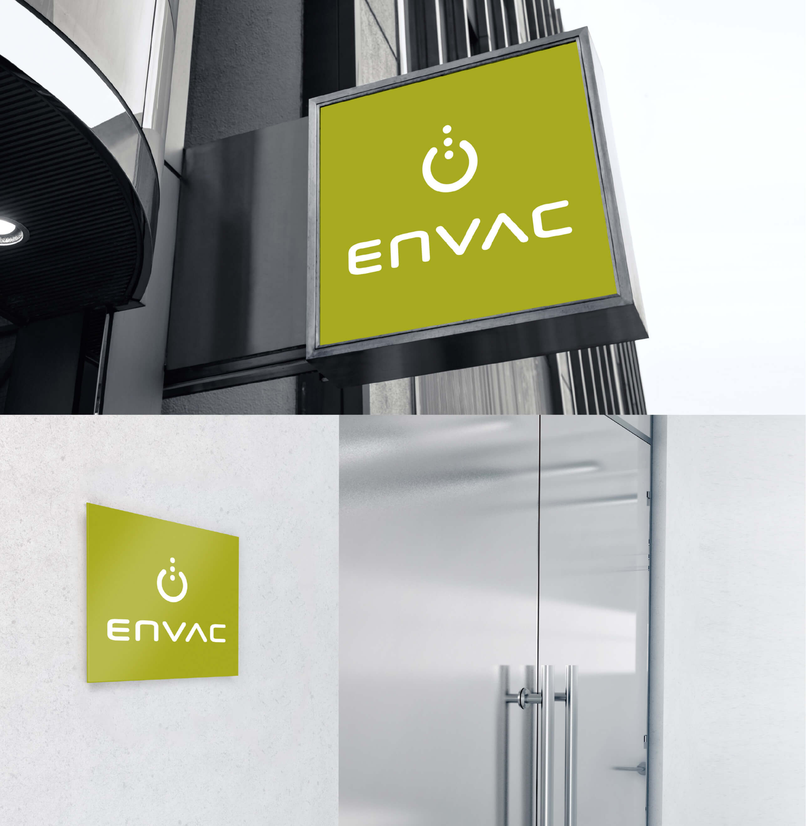
When it comes to signboards, keep a clean and simple look, as in the examples here.
Remember the shape of the logotype. If you make a green background fill on a rectangular shape instead of “square”, you will get the wrong result.
See Logo rules.
Contextual Design
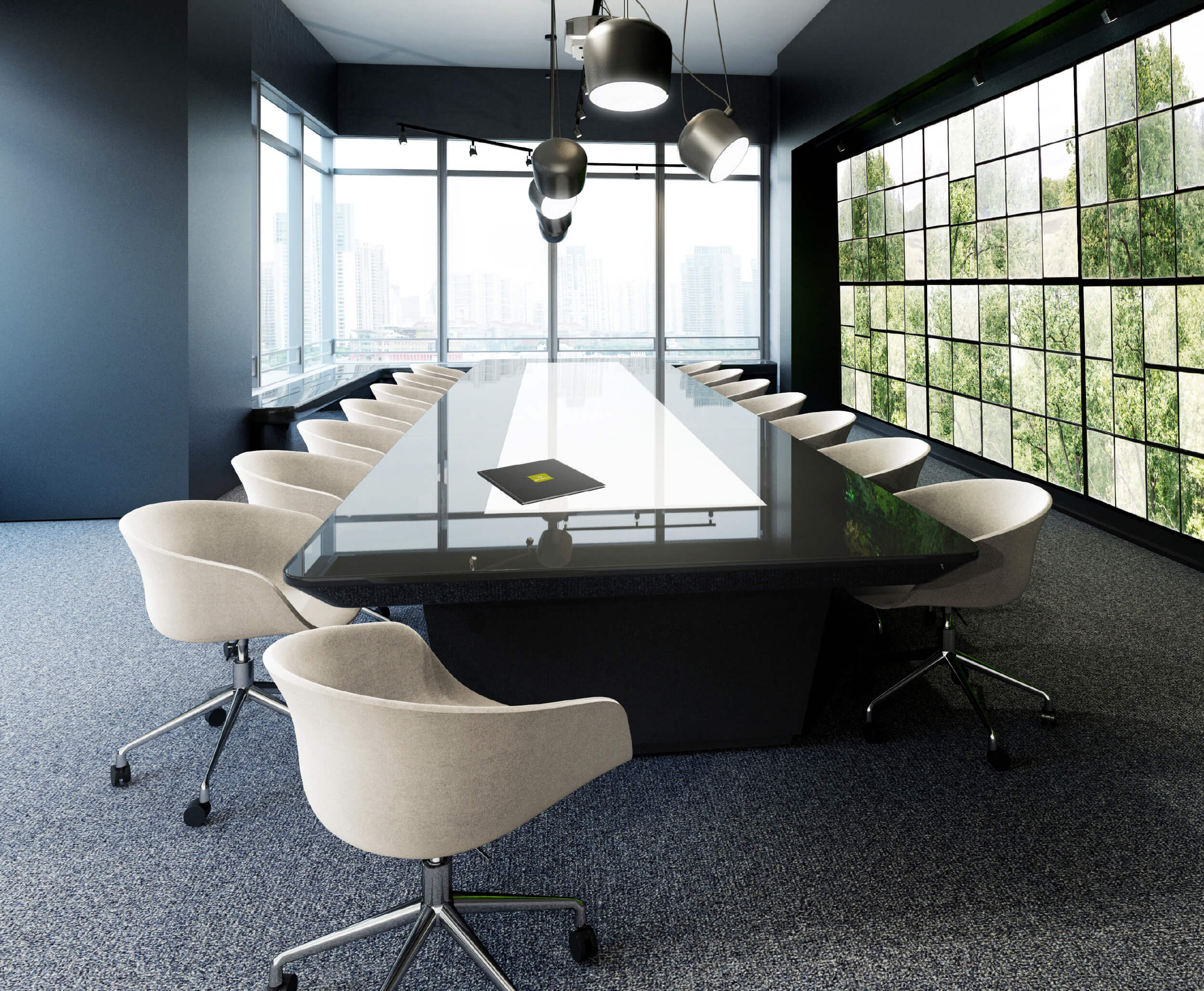
Our conference rooms highlight our passion for environmental awareness, both regarding interior design and other choice of materials. On top of each conference table lays our Brand Book.
Office
Our sustainability focus should always reflect in our choice of interior design and other office supplies. For us, environmental awareness is a guiding principle in everything we do, meaning that we have no disposable items and always recycle at our offices.
Avoid offering chocolates or cookies etc with palm oil, or bottled water.
Carpet recommendations
Choose a carpet by following any of the grey colours in our colour palette. Carpets with a low profile is ideal for our office environments. A short pile also provides easier movement for an office chair on wheels and better accommodation for heavy office furniture and equipment.
Wallpaper recommendations
Our wallpaper “Factory Window” gives our office walls a beautiful depth and a lush view. Should you have a smaller conference room, you can use framed photographs of the wallpaper instead.
Order this wallpaper here:
https://rebelwalls.com/factory-window
Start by choosing your Delivery Country on the icon top far right. Follow the instruction on how to measure your wall and order. Contact the Global Brand Manager if you need support.
Clothing
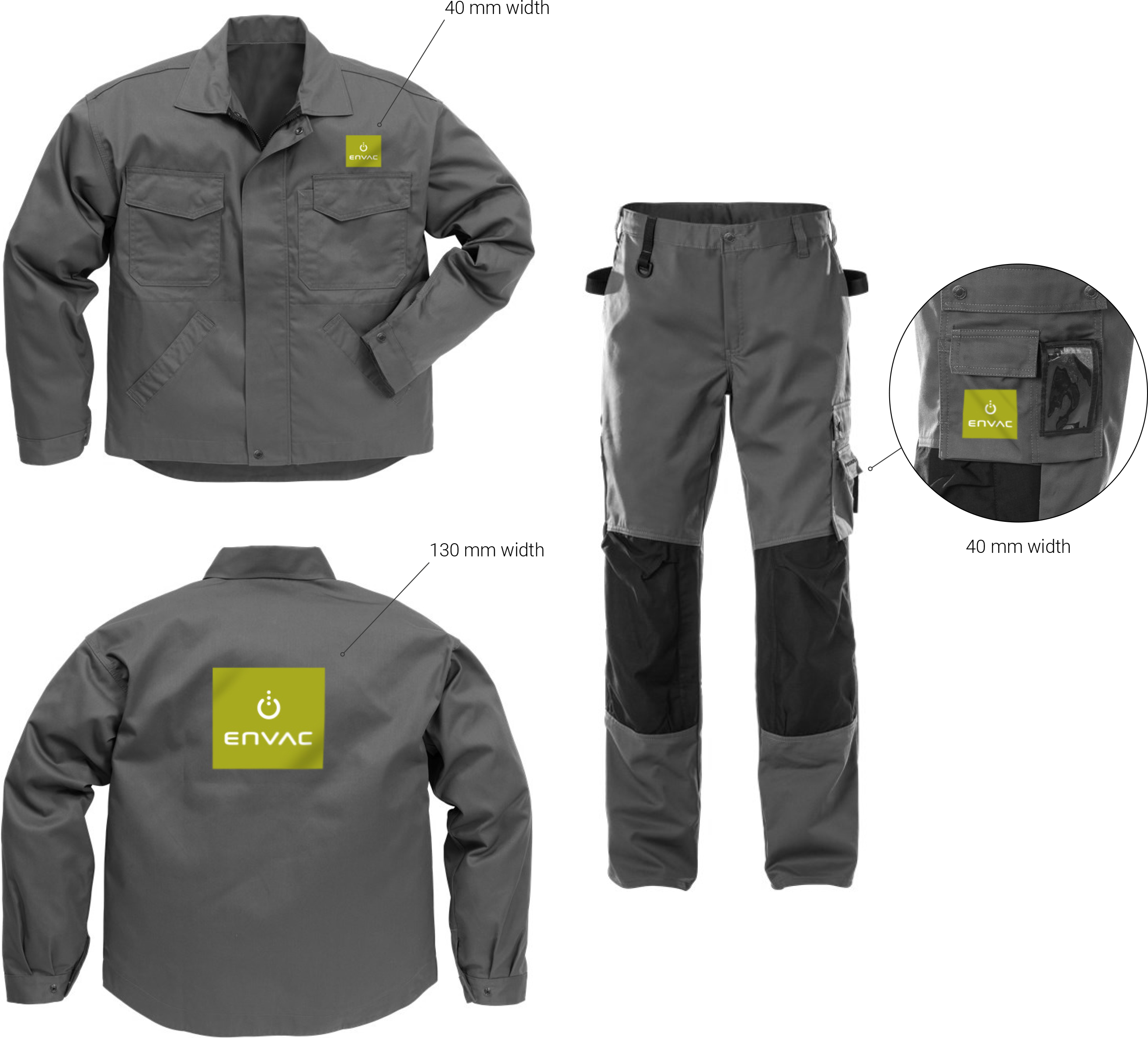
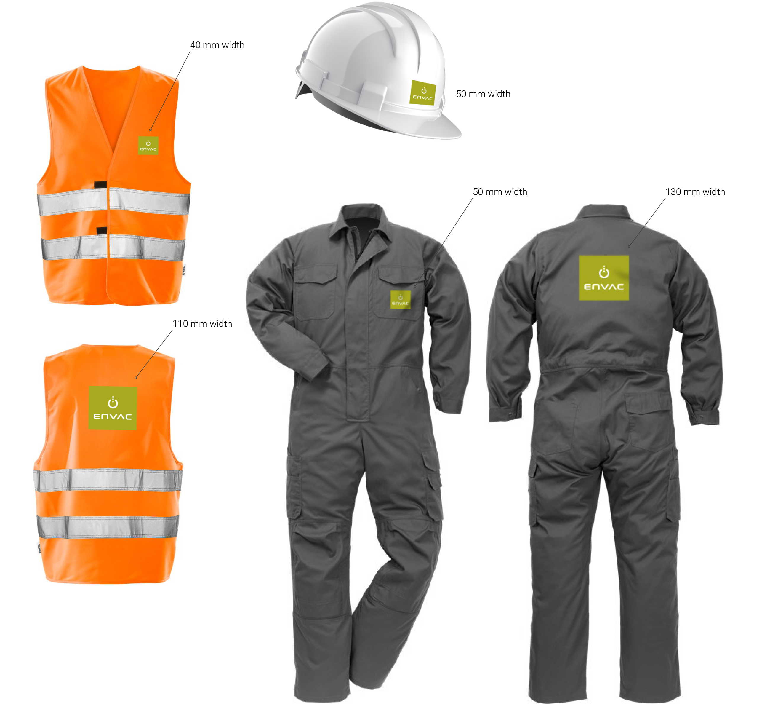
Our work and profile clothes are functional, modern and of good quality.
They convey an emotion of a knowledge-intensive organization that works for the future.
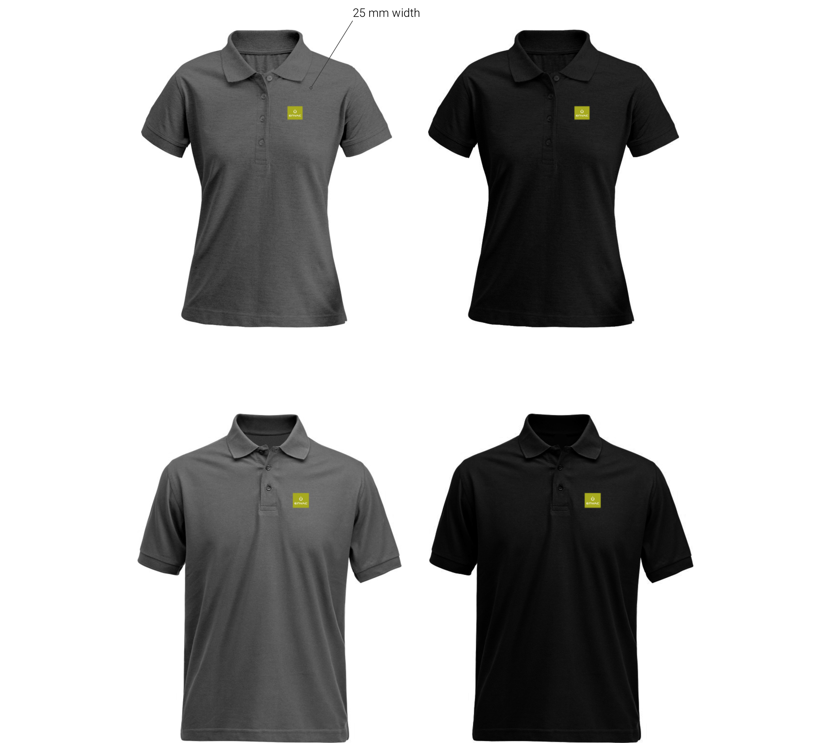
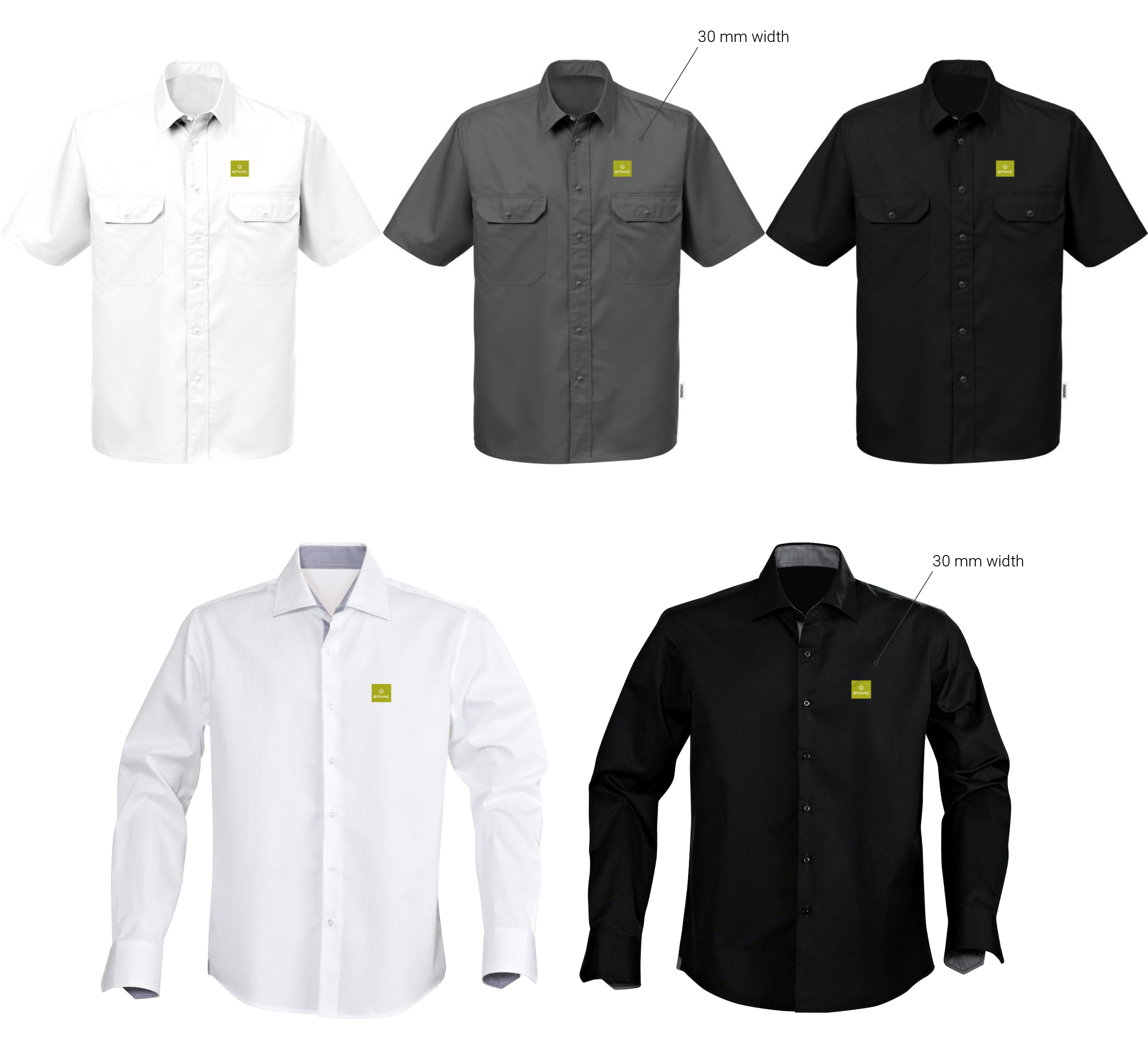
Our logo is always clear and visible on the left side of the garment, close to the heart.
Please stick to the colours shown here; grey, white and black.
Polo shirts
Short sleeve and long sleeve
Vehicles
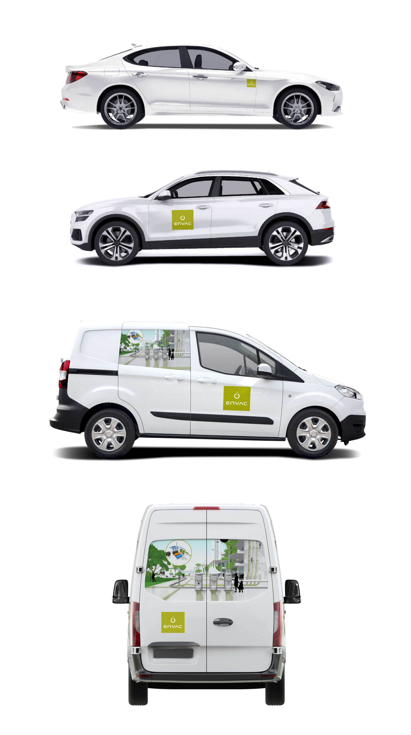
Logotype on company cars
Choose logotype size depending on the car model. Striping companies will provide a draft.
On service vans (any size) it is recommended to add our system illustration as well as the logo. Either on the two rear doors or on the side.
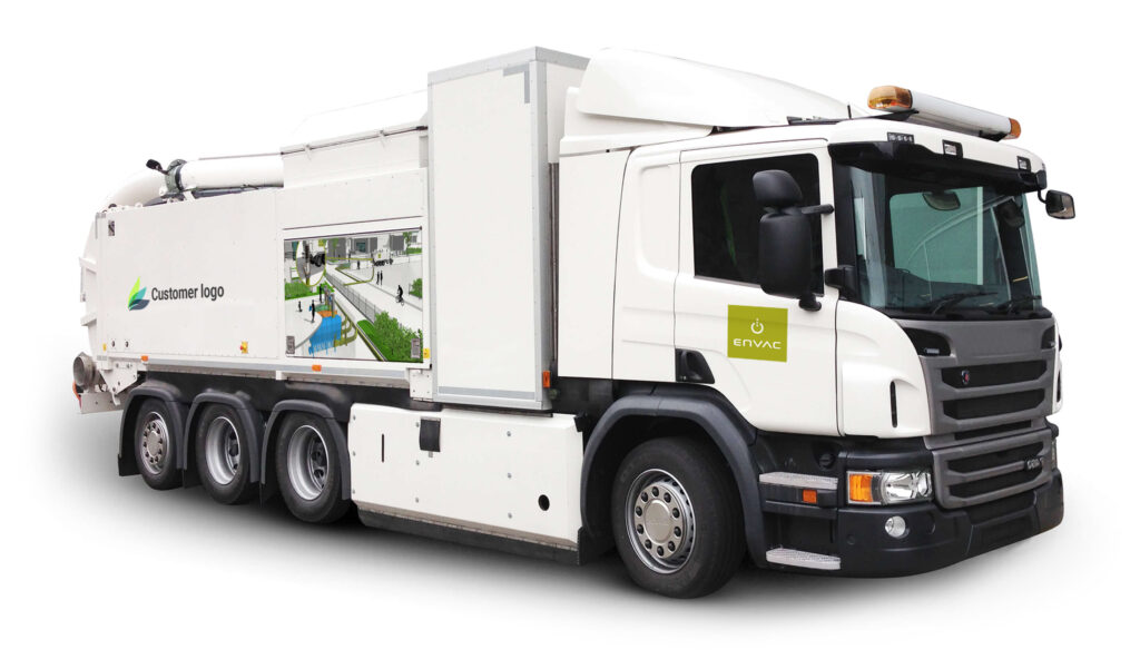
Logotype on Mobile Vacuum Truck
This is recommended for the mobile vacuum truck as well.
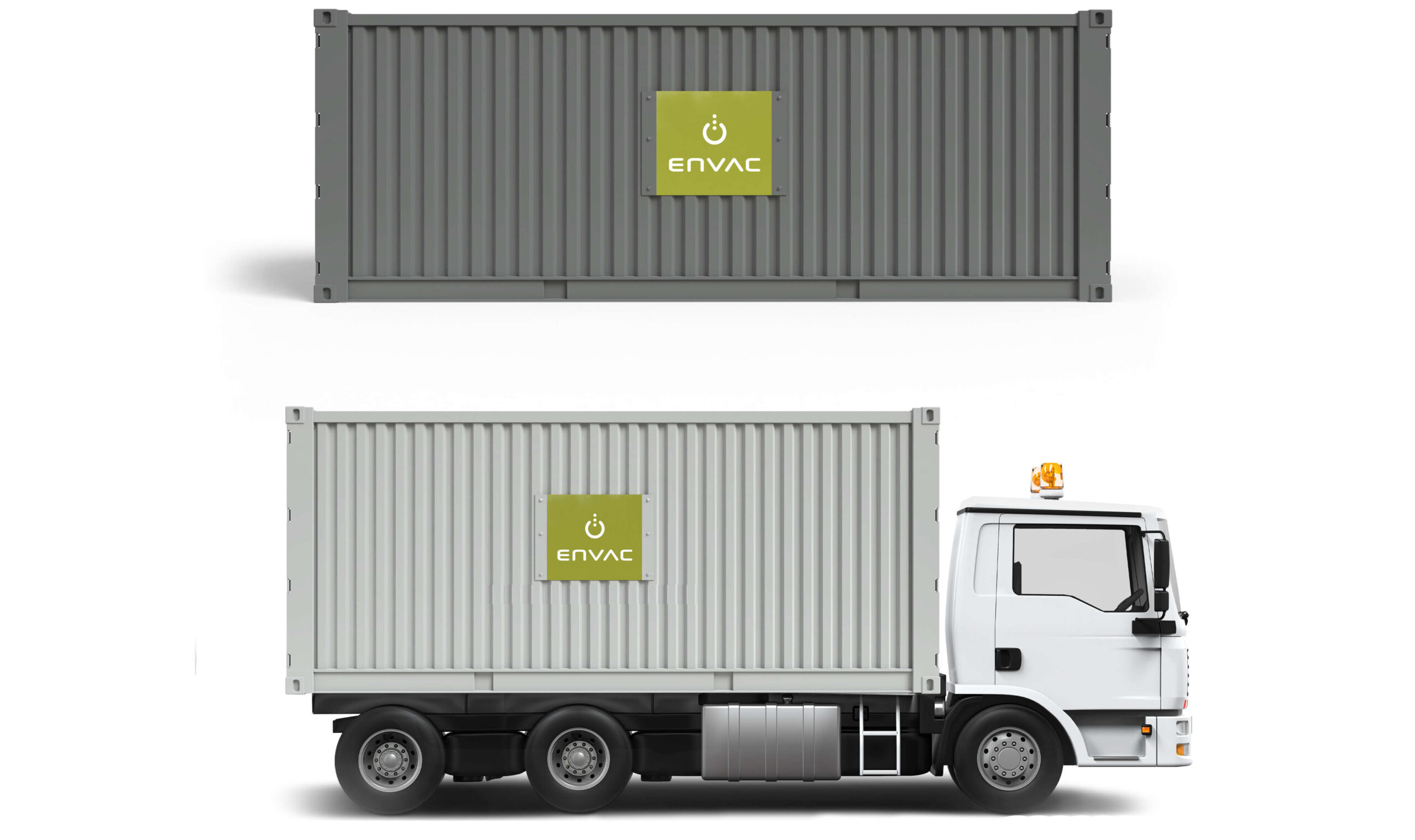
Containers
Use a metallic sign with the logotype on waste containers.
PIpes etc
Adding a logo manually can be challenging. But if you have no other choice, use a good quality peel-off sticker to avoid smudgy edges and dripping paint. See Logo/Logo rules.
